100 degrees in Siberia? 5 ways the extreme Arctic heat wave follows a disturbing pattern

Mark Serreze

Research Professor of Geography and Director, National Snow and Ice Data Center, University of Colorado Boulder

June 25, 2020 3.17pm EDT • Updated June 26, 2020 2.17pm EDT

***

This Arctic heat wave has been unusually long-lived. The darkest reds on this map of the Arctic are areas that were more than 14 degrees Fahrenheit warmer in the spring of 2020 compared to the recent 15-year average. Joshua Stevens/NASA Earth Observatory

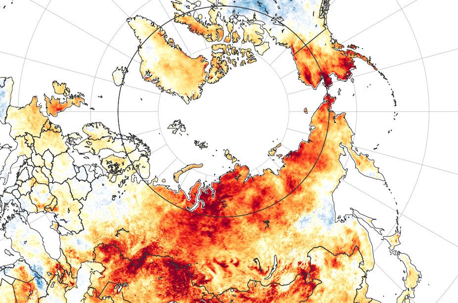
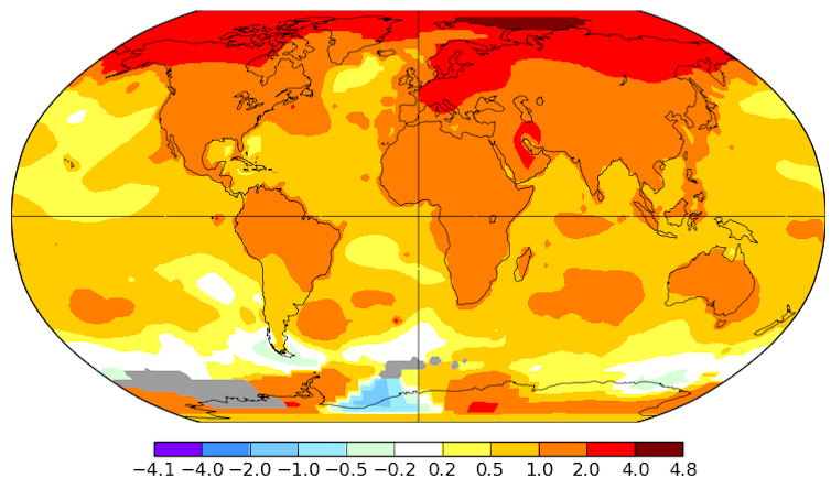
The Arctic heat wave that sent Siberian temperatures soaring to around 100 degrees Fahrenheit on the first day of summer put an exclamation point on an astonishing transformation of the Arctic environment that’s been underway for about 30 years.

As long ago as the 1890s, scientists predicted that increasing levels of carbon dioxide in the atmosphere would lead to a warming planet, particularly in the Arctic, where the loss of reflective snow and sea ice would further warm the region. Climate models have consistently pointed to “Arctic amplification” emerging as greenhouse gas concentrations increase.

Well, Arctic amplification is now here in a big way. The Arctic is warming at roughly twice the rate of the globe as a whole. When extreme heat waves like this one strike, it stands out to everyone. Scientists are generally reluctant to say “We told you so,” but the record shows that we did.

As director of the National Snow and Ice Data Center and an Arctic climate scientist who first set foot in the far North in 1982, I’ve had a front-row seat to watch the transformation.

Arctic heat waves are happening more often – and getting stuck

Arctic heat waves now arrive on top of an already warmer planet, so they’re more frequent than they used to be.

Western Siberia recorded its hottest spring on record this year, according the EU’s Copernicus Earth Observation Program, and that unusual heat isn’t expected to end soon. The Arctic Climate Forum has forecast above-average temperatures across the majority of the Arctic through at least August.

Arctic temperatures have been rising faster than the global average. This map shows the average change in degrees Celsius from 1960 to 2019. NASA-GISS

Why is this heat wave sticking around? No one has a full answer yet, but we can look at the weather patterns around it.

As a rule, heat waves are related to unusual jet stream patterns, and the Siberian heat wave is no different. A persistent northward swing of the jet stream has placed the area under what meteorologists call a “ridge.” When the jet stream swings northward like this, it allows warmer air into the region, raising the surface temperature.

Some scientists expect rising global temperatures to influence the jet stream. The jet stream is driven by temperature contrasts. As the Arctic warms more quickly, these contrasts shrink, and the jet stream can slow.

Is that what we’re seeing right now? We don’t yet know.

Swiss cheese sea ice and feedback loops

We do know that we’re seeing significant effects from this heat wave, particularly in the early loss of sea ice.

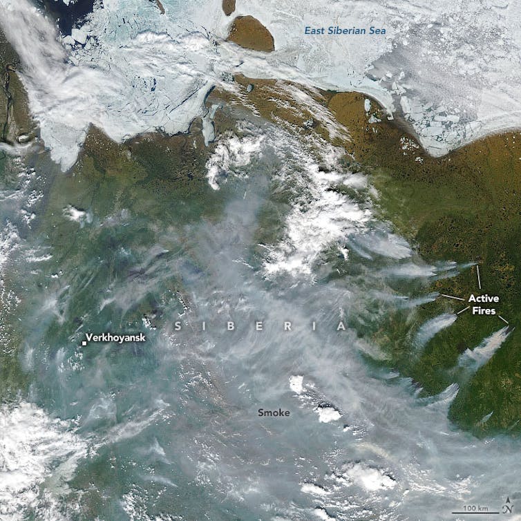
The ice along the shores of Siberia has the appearance of Swiss cheese right now in satellite images, with big areas of open water that would normally still be covered. The sea ice extent in the Laptev Sea, north of Russia, is the lowest recorded for this time of year since satellite observations began.

The loss of sea ice also affects the temperature, creating a feedback loop. Earth’s ice and snow cover reflect the Sun’s incoming energy, helping to keep the region cool. When that reflective cover is gone, the dark ocean and land absorb the heat, further raising the surface temperature.

Sea surface temperatures are already unusually high along parts of the Siberian Coast, and the warm ocean waters will lead to more melting.

The risks of thawing permafrost

On land, a big concern is warming permafrost – the perennially frozen ground that underlies most Arctic terrain.

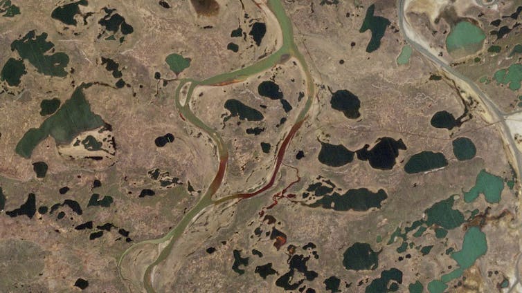
When permafrost thaws under homes and bridges, infrastructure can sink, tilt and collapse. Alaskans have been contending with this for several years. Near Norilsk, Russia, thawing permafrost was blamed for an oil tank collapse in late May that spilled thousands of tons of oil into a river.

Thawing permafrost also creates a less obvious but even more damaging problem. When the ground thaws, microbes in the soil begin turning its organic matter into carbon dioxide and methane. Both are greenhouse gases that further warm the planet.

In a study published last year, researchers found that permafrost test sites around the world had warmed by nearly half a degree Fahrenheit on average over the decade from 2007 to 2016. The greatest increase was in Siberia, where some areas had warmed by 1.6 degrees. The current Siberian heat wave, especially if it continues, will regionally exacerbate that permafrost warming and thawing.

A satellite image shows the Norilsk oil spill flowing into neighboring rivers. The collapse of a giant fuel tank was blamed on thawing permafrost. Contains modified Copernicus Sentinel data 2020CC BY

Wildfires are back again

The extreme warmth also raises the risk of wildfires, which radically change the landscape in other ways.

Drier forests are more prone to fires, often from lightning strikes. When forests burn, the dark, exposed soil left behind can absorb more heat and hasten warming.

We’ve seen a few years now of extreme forest fires across the Arctic. This year, some scientists have speculated that some of the Siberian fires that broke out last year may have continued to burn through the winter in peat bogs and reemerged.

A satellite images shows thinning sea ice in parts of the East Siberian and Laptev Seas and wildfire smoke pouring across Russia. The town of Verkhoyansk, normally known for being one of the coldest inhabited places on Earth, reported hitting 100 degrees on June 20. Joshua Stevens/NASA Earth Observatory

A disturbing pattern

The Siberian heat wave and its impacts will doubtless be widely studied. There will certainly be those eager to dismiss the event as just the result of an unusual persistent weather pattern.

Caution must always be exercised about reading too much into a single event – heat waves happen. But this is part of a disturbing pattern.

What is happening in the Arctic is very real and should serve as a warning to everyone who cares about the future of the planet as we know it.

***

Mark Serreze

100 degrees in Siberia? 5 ways the extreme Arctic heat wave follows a disturbing pattern

first published in “The Conversation” under a Creative Commons license

Daily global CO2 emissions ‘cut to 2006 levels’ during height of coronavirus crisis

Daily global CO2 emissions ‘cut to 2006 levels’ during height of coronavirus crisis

Simon Evans, Carbon Brief, 19 May 2020

***

The amount of CO2 being released by human activity each day fell by as much as 17% during the height of the coronavirus crisis in early April, a new study shows.

This means daily emissions temporarily fell to levels last seen in 2006, the study says. In the first four months of the year, it estimates that global emissions from burning fossil fuels and cement production were cut by 1,048m tonnes of CO2 (MtCO2), or 8.6%, compared with 2019 levels.

The research projects a decline of up to 2,729MtCO2 (7.5%) in 2020 as a whole, depending on how the crisis plays out. It is the first to have been through the peer-review process and is broadly in line with an early estimate for China published by Carbon Brief in February, as well as separate global estimates published last month by Carbon Brief and the International Energy Agency.

Today’s study also marks the first-ever attempt to quantify CO2 emissions on a daily basis, for the world and for 69 individual countries, in close to real time. Until now, annual CO2 emissions data has typically been published months or even years later.

A publicly available daily estimate of global or national CO2 emissions would be “incredibly useful, particularly for motivating policy action and pressure”, another researcher tells Carbon Brief.

Coronavirus crisis

The ongoing coronavirus crisis has claimed the lives of hundreds of thousands of people around the world and seen the introduction of severe restrictions on movement in many countries.

These lockdowns have included “stay at home” orders, border closures and other measures that have had direct effects on the use of energy and, consequently, on the release of CO2 emissions.

As the crisis has unfolded, so too have attempts to quantify its impact on CO2 emissions. These efforts have been challenging, however, because real-time CO2 emissions data does not exist.

The annual emissions inventories that countries submit to the UN take years to compile – and even these are estimates rather than direct measurements.

Greenhouse gas emissions are estimated using a variety of methods, often based on “activity data”. This might be the number of miles being driven, the amount of electricity generated or even – in the case of nitrous oxide, which is used as a propellant  – via cream consumption.

Today’s study, published in Nature Climate Change, combines activity data for six sectors with a “confinement index” of lockdown measures in each country or region over time.

This allows for an estimate of changes in daily global CO2 emissions in January-April 2020, relative to the 100MtCO2 released on an average day in 2019.

During peak confinement in individual countries, daily CO2 emissions fell by 26% on average, the paper says. However, the size of this effect is reduced at a global level, because not all countries were under the most severe type of lockdown at the same time.

At the peak of the crisis in early April, regions responsible for 89% of daily CO2 emissions were under some form of lockdown, the paper says. Daily global CO2 emissions fell to 83MtCO2 (-17%, with a range of -11 to -25%) on 7 April, equivalent to levels last seen in 2006.

In a press release, lead author Prof Corinne Le Quéré, professor of climate change science at the University of East Anglia’s Tyndall Centre (who will be a panelist at Carbon Brief’s webinar on 21 May), says:

“Population confinement has led to drastic changes in energy use and CO2 emissions. These extreme decreases are likely to be temporary, however, as they do not reflect structural changes in the economic, transport, or energy systems.”

Daily data

In order to estimate daily global CO2 emissions, the researchers use a novel approach that combines sectoral activity data with a country-by-country confinement index.

The paper looks at six sectors, shown in the chart below according to their share of global CO2 emissions from fossil fuels and cement. These are electricity and heat (44%); industry (22%); surface transport (20%); homes (6%); public buildings and commerce (4%); and aviation (3%).

Share of global CO2 emissions from fossil fuels and cement due to each of six sectors of the economy. Source: Le Queré et al. (2020). Chart by Carbon Brief.

Notably, this split highlights the limited potential for individual actions to radically reduce global emissions, in contrast to the societal choices that govern CO2 from electricity and industry.

The split in global CO2 emissions, shown above, is then broken down further for each of 69 countries, 50 US states and 30 Chinese provinces, which account for 97% of the global total. This gives industrial CO2 emissions in Italy, for example, on an average day in 2019.

The paper then uses 669 datasets, covering each of these sectors over time, and classified according to the level of confinement in place at each point. For example, this might be daily reports on mobility, traffic and congestion to measure “activity” for surface transport.

This daily data is then adjusted to remove effects unrelated to coronavirus, such as the mild northern hemisphere winter or the day of the week.

Under the highest level of confinement, surface transport “activity” fell by 50% on average, the paper finds. This is shown in green in the chart, below, where each dot represents a single data point, open circles show the average and the horizontal lines show the variability between datasets. The chart also shows changes in activity for electricity, industry, homes and aviation.

Change in sectoral “activity” under the highest level of coronavirus confinement, percent, relative to an average day in 2019. Each dot represents a single datapoint and open circles show the average. Reading from left to right, the chart shows activity changes in the power sector (purple), industry (yellow), surface transport (green), homes (blue) and aviation (pink). Source: Le Queré et al. (2020).

For electricity, the paper looks at total daily demand in Europe, the US and India, finding an average 15% reduction in demand under strict lockdown. In industry, the paper looks at daily coal use in China reported by Carbon Brief and weekly reports on steel production in the US.

For homes, the paper draws on figures from UK smart meters. And for aviation – the most strongly affected sector – it uses data on domestic and international departures around the world.

As the chart above shows, the analysis relies on relatively sparse information for industry, whereas activity levels in transport draw on a wider range of datasets.

Emissions estimates

The team then uses the average change in activity, for each sector and level of confinement, to build up an estimate of daily CO2 emissions around the world.

For example, on days when Turkey is under the strictest lockdown, the analysis assumes that its power-sector CO2 emissions would fall by 15% compared with the average in 2019 – and those from surface transport by 50%.

When Turkey shifts from “confinement index three”, the strictest controls, down to level two, its power-sector emissions would be 5% below usual levels and transport 40% lower. For each confinement level, the same percentage reductions are assumed to apply to all countries.

This approach means that the team only needed to know when each country, state or province changed its coronavirus lockdown from one “confinement level” to another, as well as the daily average level of CO2 emissions from each sector in 2019.

Putting all of these countries and lockdown levels together, the paper finds that the cut in daily global CO2 emissions peaked at -17% on 7 April, shown in the figure, below. Across the first four months of 2020, emissions fell by 1,048MtCO2 (8.6%), compared with 2019 levels.

Estimated daily global CO2 emissions from fossil fuels and cement, million tonnes (MtCO2 per day). The left panel shows emissions from 1970-2020 and the right panel shows the first four months of 2020. Source: Le Queré et al. (2020).

Within this global total, the largest impacts were in China, where emissions fell by an estimated 242MtCO2 in the first four months of the year, followed by the US (-207MtCO2), Europe (-123MtCO2) and India (-98MtCO2).

Dr Glen Peters, research director at Norwegian climate institute Cicero and one of the study authors, tells Carbon Brief that while the approach was designed around the current crisis, the team has gathered the “raw material” to make daily CO2 estimates on an ongoing basis. He says:

“We have discussed more ‘real-time’ estimates for sometime and there are many advantages. We are illustrating one advantage with our paper to see the consequences of particular policy interventions in near real time.”

But Peters notes that some of the daily data they used – the urban congestion index series from satnav maker TomTom, for example – is only being made publicly available during the current crisis and might be made private again in the future. He also asks whether daily data is truly needed, or whether weekly or even monthly estimates might be sufficient for scientists and policymakers.

Dr Hannah Ritchie, head of research at website Our World in Data and one of the reviewers of the new study, tells Carbon Brief:

“I think daily CO2 estimates would be incredibly useful, particularly for motivating policy action and pressure…Climate change already has the classic long-termism problem, but this is exacerbated by the fact that we get a figure on CO2 emissions published once a year, as a marker of how each country is doing.”

If daily CO2 estimates were publicly available for all countries, it would become possible to actively track progress, she says, adding: “You can have a counter on the news, or an app or dashboard on your phone – just like we do with other metrics like stock markets.”

Alternative analyses

Today’s research is not the first to analyse the CO2 impacts of the coronavirus crisis, although it is the first to have completed its passage through peer review.

Another paper, which is currently in review, also attempts to estimate daily global CO2 emissions in close to real time. This work finds the coronavirus crisis cut global emissions by -542MtCO2 below 2019 levels in the first quarter of 2020, similar to the -530MtCO2 figure from today’s paper.

In mid-February, Carbon Brief published an analysis showing that emissions in China were temporarily cut by 200MtCO2 (25%) over a four-week period, during the height of the restrictions. The new study finds that the cut in Chinese emissions peaked at 24%.

Today’s research also includes estimates of the emissions impact in 2020 as a whole, based on three scenarios for the length of lockdowns around the world. These entail CO2 emissions falling by between -4% and -8%, depending on how the crisis plays out. This range is consistent with estimates published in April byCarbon Brief (-6%) and the International Energy Agency (-8%).

***

Daily global CO2 emissions ‘cut to 2006 levels’ during height of coronavirus crisis

Simon Evans, Carbon Brief, 19 May 2020

Published under a CC license. You are welcome to reproduce unadapted material in full for non-commercial use, credited ‘Carbon Brief’ with a link to the article. 

IEA: Coronavirus impact on CO2 emissions six times larger than 2008 financial crisis

IEA: Corona virus impact on CO2 emissions six times larger than 2008 financial crisis

Written by Josh Gabbatiss. Published on Carbon Brief, 30 April 2020.

The world’s CO2 emissions are expected to fall by 8% this year as the coronavirus pandemic shuts down much of the global economy, according to the International Energy Agency (IEA).

Such a drop would be the largest ever recorded in terms of tonnes of CO2, some six times greater than the impact of the 2008 financial crisis.

The agency’s new Global Energy Review is based on extensive data from the year so far and is intended to provide close to a real-time estimate of energy usage and emissions.

Its projections for the whole of 2020 are based on a series of assumptions including that the lockdowns, curfews and closure of schools and businesses currently in place are gradually eased over the coming months.

However, as the pandemic spreads and its devastating impacts continue to unfold, the agency makes clear that there are still “major uncertainties” about how it will play out.

The IEA’s central figure of 8% is even higher than previous estimates, including analysis conducted by Carbon Brief and published earlier this month, which was based on a less comprehensive dataset and less recent data.

An 8% cut is roughly equivalent to the annual emissions reductions needed to limit warming to less than 1.5C above pre-industrial temperatures. However, the stretch target laid out in the Paris Agreement would require similar reductions every year this decade.

The agency is clear that the expected decline in emissions due to a pandemic is “absolutely nothing to cheer”. Moreover, it emphasises the importance of prioritising clean energy in economic recovery plans in order to avoid a sharp rebound in emissions.

Unprecedented shock

Describing the pandemic as a “a macroeconomic shock that is unprecedented in peacetime”, the IEA draws comparisons with the impact that wars and other recent crises have had on the global energy system. Some of these events can be seen in the figure below.

The report compares the covid-19 pandemic with the last financial crisis, when growth in China and India “was able to largely offset reductions elsewhere”. This time around, both nations are also feeling the effects of the disease and such an offset is unlikely.

Global energy-related emissions (top) and annual change (bottom) in GtCO2, with projected 2020 levels highlighted in red. Other major events are indicated to a give a sense of scale. Source: IEA Global Energy Review.

As it spreads to virtually every nation on the planet, the impact of coronavirus is being felt in all walks of life, but different sectors are being affected in very different ways.

Energy use for residential gas heating or electricity use for server farms and digital equipment may even show a significant increase in the coming months, the IEA says, whereas other sectors such as aviation have collapsed.

Global energy demand was 3.8% lower in the first quarter of 2020 than last year, the IEA says, and it expects the annual total to drop by 6% year-on-year in 2020. 

Such a decline has not been seen for decades, as the chart below shows, and will effectively wipe out five years of demand growth.

Annual rate of change in primary energy demand, %, since 1900, with key events impacting demand highlighted. Source: IEA Global Energy Review.

CO2 emissions are expected to fall to 30.6bn tonnes of CO2 (GtCO2) this year, an 8% drop from last year, with declining coal use the most significant factor.

The drop in coal combustion is being driven mainly by the power sector, the IEA says, together with competition from cheap natural gas and industrial slowdown. Coal demand is expected to fall 8%, but as China’s industrial sector starts up again, it is expected to go some way to offsetting larger declines.

Demand (left) and annual change in demand (right) for the total quantity of coal used globally (dark) and coal in the power sector alone (light), measured in million tonnes of coal equivalent (Mtce). The change in demand for the first quarter of 2020 (Q1) is shown in red while the projection for the full year is shown in pink. Source: IEA Global Energy Review

Due to the global lockdown’s impact on transport, illustrated in the charts below, demand for oil has fallen at an “unprecedented scale” in the first four months of the year.

Change in road transport activity and flight numbers as a % in 2020 so far compared to the previous year, for selected countries (solid lines) and the whole world (dashed line). Source: IEA Global Energy Review

This is particularly true for fuels used in passenger transport, namely petrol and kerosene. Meanwhile demand for diesel, a substantial portion of which is used to power vehicles that transport goods, is expected to remain stronger. Overall, oil demand is expected to drop by 9% across the year after a 29% drop in the month of April.

As a side-effect of declining transport activity, car sales are expected to decline. In March, EU sales were 55% lower than 2019 levels, and if this trend plays out in nations with fuel economy standards in place, improvements in energy efficiency will be slower, the IEA notes.

Gas demand is expected to fall less than oil or coal as it is less vulnerable to changes in transportation demand, although the IEA says it could still fall by 5%. Gas will be particularly susceptible if countries in the Middle East and North Africa enter long lockdowns, the agency says, due to their reliance on the fuel for power.

In general, nuclear power is expected to fare better than fossil fuels, with lockdowns expected to reduce global output by 3% due to falling demand and disrupted construction. Already, delays have been announced to projects in China and Finland, and more are expected in the UK, US and France.

As the figure below shows, lockdowns in recent months have pushed down electricity demand significantly, with the strongest impacts found in nations with service-based economies and the strictest lockdowns, such as Italy.

Weather-corrected change in electricity demand, %, in selected countries implementing full (solid lines) or partial lockdowns (dashed lines), by number of days since their lockdowns began. Source: IEA Global Energy Review

It is worth noting that as pointed out in Carbon Brief’s recent analysis, it is difficult to assign effects specifically to coronavirus as many other factors will influence energy demand and emissions over the course of the year.

As an example, the IEA points to “milder than average” weather throughout most of the northern hemisphere in the first quarter of the year, which played a part in pushing down energy demand due to less gas being used for heating.

Renewables ascend

As fossil fuel use sank in the first few months of 2020, renewables remained stable, as in general they are given priority access to electricity grids and are not required to adjust their output based on demand. 

Combined with rising capacity as new wind and solar facilities are built, this means that renewable electricity generation rose by almost 3% in the first quarter of the year.

As a result, renewables achieved record-high hourly shares in Belgium, Italy, Germany, Hungary and parts of the US. Analysis just published by Carbon Brief shows a similar trend, with wind and solar reaching a record-high share of generation across Europe over the past 30 days.

These records reflect a rising renewable share of the electricity mix of countries around the world – where demand has declined during lockdowns – as shown in the chart, below.

Changes in the electricity mixes of key emitters in 2020 so far, with the implementation of lockdown strategies indicated by grey shading. Source: IEAGlobal Energy Review

In fact, renewables are also the only energy sources expected to grow this year “regardless of the length of lockdown or strength of recovery”, the report states. This can be seen in the figure below.

Projected % change in primary energy demand by fuel type in 2020 compared to the previous year, with renewables (green) showing the only positive change. Source: IEA Global Energy Review

The chart below shows how a pandemic recovery, in which restrictions are gradually loosened over the course of the year, is expected to push low-carbon electricity sources to 40% of power generation in 2020, extending the slight lead on coal achieved last year. This would be the highest level on record, albeit due in part to a 5% dip in total electricity demand.

Global generation % shares from coal (red line) and low-carbon sources (shaded area), including nuclear (yellow) and all renewables (different shades of green). Source: IEA Global Energy Review

New projects coming online this year are expected to increase wind and solar’s share of global electricity generation up to 9%, twice as high as levels seen just five years ago.

The IEA estimates total renewable energy use, including for heat and transport, will rise by about 1% in 2020, and there will still be an increase even if economic recovery is slow. 

However, despite being more resilient than other industries, the renewable sector has still faced challenges. The end of 2020 marks an important deadline for new wind projects in the US and China to receive tax credits and subsidies, but progress on these projects is now highly uncertain.

In a recent blog post, IEA analyst Heymi Bahar writes that what was meant to be “an outstanding year for renewables” has been hindered by supply chain and labour disruptions linked to the pandemic.

Wind turbine manufacture has been hit particularly hard due to a very global supply chain compared with solar panels, which are largely manufactured in China.

Methods and discrepancies

When Carbon Brief attempted to calculate a figure for total CO2 emissions decline this year due to coronavirus, it reached a slightly more modest figure of  5.5%, compared to the IEA’s 8%.

This analysis was based on five key datasets that cover roughly three-quarters of the world’s annual CO2 emissions, with the expectation that the elements not covered would have added to the final total.

The IEA has access to a much larger array of detailed information, and its analysis was based on data available up until mid-April including country submissions to the IEA, other statistical releases from national administrations and estimates by the agency itself when official data was missing.

Published on Carbon Brief, 30 April 2020, under a CC license. Unadapted material may be reproduced in full for non-commercial use, credited ‘Carbon Brief’ with a link to the article.

art, museums, & climate risk | the Pérez Art Museum Miami

Museums, as stewards of cultural heritage, are in it for the long term. To safeguard the artistic, historic and scientific resources they hold in trust for the public, museums need to adapt to a world where change—and water—are the new normal.

Designing for Resilience, Elizabeth Merritt, founding director, Center for the Future of Museums, an initiative of the American Alliance of Museums

The Swiss architectural firm of Herzog & de Meuron designed what is now called the Pérez Art Museum Miami (PAMM). The museum is anchor for a 30-acre museum park on Biscayne Bay in downtown Miami. The Biscayne Bay location was provided by the City of Miami. Construction of the building cost $220 million. $100 million was provided by Miami-Dade voters in general obligation bond funding. $120 million came from private donors.

The museum of modern and contemporary art is dedicated to collecting and exhibiting international art of the 20th and 21st centuries. The museum holds the largest collection of contemporary Cuban art in the United States.

The National Climate Assessment of 2014 named Miami one of the U.S. cities most vulnerable to severe damage as a result of rising sea levels. According to the report, sea levels have risen eight inches since 1870. The report projects a further rise of one to four feet by the end of the century.

The National Climate Assessment of 2014 found that while melting Arctic and Antarctic ice and rising sea levels are threatening the entire American coastline, Miami is exceptionally vulnerable due to its natural geology.

The city of Miami is built on top of porous limestone. The limestone absorbs seawater. The rising sea waters are being absorbed into the city’s foundation. The water bubbles up through pipes and drains, encroaches on fresh water supplies and saturates infrastructure. County governments estimate that the damages could rise to billions or even trillions of dollars.

In such circumstances and given Miami’s geology, how is the Pérez Art Museum Miami designed to fulfill its responsibilities as a steward of art and cultural heritage?

The architecture has been designed to adapt to the climate of Miami. The new building, opened in 2013, was specifically designed to withstand hurricanes. The museum is raised on an elevated platform above the flood plain. The museum features the largest sheets of hurricane-resistant glass in the U.S. Art storage facilities are situated more than 46 feet above sea level. The museum’s backup-electricity system runs on generators. The generators are located on the third floor.

  • The first floor of the museum was elevated by Herzog & de Meuron above the 18-foot high-water mark left by Category 5 Hurricane Andrew in 1992. The elevation acts as a safety cushion for projected effects of climate change.
  • Gaps in the floors of the patio surrounding the museum allow water from rain, storm surge or flooding to drain into the parking garage, located underneath the museum.
  • A power generator is located on the third floor of the museum. Electricity to the building is ensured even if lower floors are affected by flooding. The generator has enough fuel for three days of use, and can be refueled by truck or barge (in case the roads are blocked).
  • Second-floor windows feature the largest panels of hurricane-resistant glass in the US (17.5 feet tall by seven feet wide, each weighing 2,500 pounds).
  • The teak entrance doors weigh 550 pounds each. They each feature a multi-prong pin system. The pin system locks the doors in several places to secure them against category-five hurricane winds.
  • The hanging gardens, inclusive of the mechanical system and irrigation system, are designed to withstand a category five hurricane.
  • Should a major hurricane head towards Miami, the museum maintains plans to de-install and place in storage as much of the art as possible, starting with the most sensitive works, such as particularly rare works on paper that are sensitive to humidity and temperature fluctuations.
  • The museum’s art storage facility is situated 46 feet above sea level. This is to ensure security from flooding and water damage. Storage HVAC is designed to handle humidity levels that might follow a storm event.

See:

Jorge Pérez Donates $15 Million in Cash and Art to Miami Museum” | Hili Perlson, Artnet, 30 November 2016

Designing for Resilience” | Elizabeth Merritt, Center for the Future of Museums, an initiative of the American Alliance of Museums, 11 August 2015

Protecting Priceless Art from Natural Disasters | John Whitaker, The Atlantic, 27 May 2015

Trendswatch 2015” | Elizabeth Merritt, Center for the Future of Museums, an initiative of the American Alliance of Museums

“Miami Finds Itself Ankle-Deep in Climate Change Debate” | Carol Davenport, The New York Times, 7 May 2014

Pérez Art Museum” | Knippers Helbig Advanced Engineering

National Climate Assessment

Pérez Art Museum | Wikipedia


#PérezArtMuseumMiami #Miami #Herzog&deMeuron #JorgePérez #art #artcollections #climaterisk #resilience #realestate #artstorage #electricity #powergeneration #carbondioxide #CO2 #risingsealevels


CO2 vibrates, that’s just what it does

The CO2 molecule vibrates. As a matter of fact, it vibrates in three different ways. As it vibrates, it absorbs and emits the radiant heat (energy) of our sun as it reaches our earth, and it does so very well and very efficiently … That’s just what it does.

The CO2 molecule is composed of three atoms: one atom of carbon (C) and two atoms of oxygen (O). Hence CO2, carbon dioxide (“di” refers to “two”).

The carbon and oxygen atoms move around each other and interact with each other at different frequencies. Each different way of moving around constitutes a vibration mode.

In one vibration mode, with the oxygen and carbon atoms interacting at a certain frequency, the CO2 molecule attracts and absorbs the energy (radiant heat) of the sun. Just the way a magnet might attract a paper clip.

As the molecule absorbs the energy of the sun, it switches into another vibration mode, moving faster. In this faster vibration mode, with the carbon and oxygen atoms interacting at another frequency, the energy of the sun is emitted. Think of two magnets, repulsing each other.

This is a very good thing. Without the presence of these little CO2 factories doing their work day in and day out, absorbing and emitting the radiant heat (energy) of our sun, our planet would be a frozen ball of ice.

These little CO2 factories do their work well and efficiently. That’s just what they do. The more of them there are in the atmosphere, the more radiant heat is absorbed and emitted into the air all around all of us.

See:

What is Infrared?” | Jim Lucas, Live Science, 26 March 2015

Carbon Dioxide Absorbs and Re-emits Infrared Radiation” | UCAR Center for Science Education

Molecules Vibrate” | UCAR Center for Science Education

John Tyndall” | Wikipedia

Introduction to Structure Determination; Infrared: Introduction” | Prof. Adam Bridgeman, School of Chemistry, The University of Sydney, 2017.